Saturday, 26 February 2011
Thursday, 24 February 2011
Tuesday, 22 February 2011
Sunday, 20 February 2011
Friday, 18 February 2011
Wednesday, 16 February 2011
Monday, 14 February 2011
Audience Feedback Questionnaire Planning
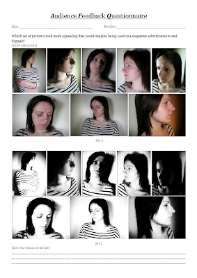
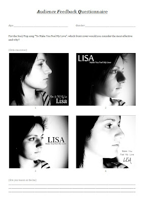
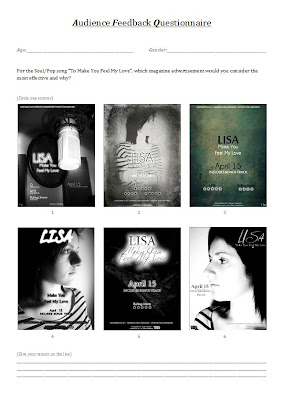
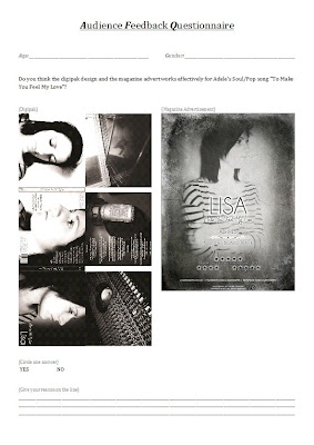
These are the questionnaires that I've designed so far to gain audience feedback about the planning of my ancillary texts and also the our final video.
Saturday, 12 February 2011
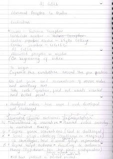
Evaluation Planning
This is how I went about planning my evaluation. By taking some notes on what should be mentioned in the evaluation, I've made a clear structure on what I should consider writing about and how it should be laid out. I've jotted a few notes that I thought of myself just as a reminder of what I could mention.
Thursday, 10 February 2011
Changes To The Video
Since the first edit of the music video, Lisa and I have decided to change a scene of the video so that it finds in more perfectly with the song. After receiving feedback about our first edit, we found out that the scene of the first flashback can be seen to drag on a bit, due to the both shots being around 10 seconds long. Therefore we've decided to change the length of the song so that each line is accompanied by its own clip. Due to the original story, of Lisa and Jacob meeting through a broken umbrella, being a complicated one to have different shots to we had decided to think of a complete different situation. Now the scene will show Lisa drawing the statue at Marina and Jacob taking pictures of Grimsby with is over the river. Jacob will reverse into Lisa which causes her to drop her artwork to which Jacob helps in grabbing them. Jacob is shown to apologise whilst feeling guilty and he eventually hands Lisa's work back to her. Due to just bumping into a handsome guy, Lisa feels shy and bashful while thanking Jacob.
These are the images showing what actions occur in each clip.
Tuesday, 8 February 2011
Sunday, 6 February 2011
Music Video - First Edit
This is our music video so far however plenty more editing and filming needs to be done for it to be complete. The song hasnt yet been applied over the videos therefore both the song and noises in the videos can be heard.
Friday, 4 February 2011
Feedback
The main points in our video that we received feedback for was:
1. The entire narrative. Originally the narrative of our video was constrcuted to show the protagonist's quest to meet the antagonist whilst reminiscing about past events. Due to Lisa singing the song rather than us using an original copy of Adele singing the song, a suggestion was made to enhance the narrative a bit more. After mentioning that we were going to record Lisa singing in the studio we were told we could add elements of the recording studio or even film some shots in the studio. This allows us to show Lisa singing the song in the studio as well as the protagonist going on her journey.
2. The lighting in scenes when Lisa's walking down a dark streets. Due to the darkness the quality of the image was more pixelated therefore everything in the frame wasn't able as clear as we would have with a light. To overcome this we had borrowed a professional camera light which mainly lit up Lisa but not so much the background, however the background had lighting itself and if the light was to hit the ground then it would appear like an artificial light has deliberately been used. This allowed us to present our protagonist clearly and the background naturally.
2. The lighting in scenes when Lisa's walking down a dark streets. Due to the darkness the quality of the image was more pixelated therefore everything in the frame wasn't able as clear as we would have with a light. To overcome this we had borrowed a professional camera light which mainly lit up Lisa but not so much the background, however the background had lighting itself and if the light was to hit the ground then it would appear like an artificial light has deliberately been used. This allowed us to present our protagonist clearly and the background naturally.
3. The length of the first flashback. There were only two clips within the second verse and each clip covered 2 lines each, this made the verse appear slightly boring and as though its dragging which wasn't helped by the action with was kept basic. By re-shooting the scene we were able to change the narrative of how our actors met therefore allowing there to be more shots to experiment meant. Having a variety of shots meant that the entire scene wouldn't drag. Another advantage we gained from this is the time of the day was nice and clear despite it spitting during the filming therefore this contrasts to the very last scene which is based in the dark and also contrasts from our original clips of the flashback which was also filmed in the dark.
4. The first flashback. Some elements in the lacked continutity such as when the shot when antagonist bumps into the protgaonist which is followed by them both knelt down whilst gathering the papers. A solution for this was to have a shot of both their hands sorting out the cluster and then show them both helping together. Another shot which could have been improved is the very last one where they're both shown stood up already despite the last shot showing them both going to stand up from a knelt position. To improve we were suggested to have the last shot show the couple in the process of standing up rather than already stood up. These two suggestions will help the continuity of the scene and allow the narrative to be a bit mroe clear thus helping the audience to keep up and understand whats happening.
5. The stucture of the last scene. This scene seems to drag due to the last scene being all about the protagonist expressing her love therefore we decided to keep it as an entire clip so that it could show how meaningful and emotional the situation. By using different shots the scene won't appear as long and boring therefore we've dedicated a few different angles and movements to each line of the verse. Rather than having the couple already in the frame, they'll be shown to move into the shot which will be followed by over the shoulders shots from both characters and a circle around to show the antagonist's reaction as well as the protagonist expressing herself. To make the ending seem more loving and intimate we've been suggested to have the couple hug and cuddle at the end so it shows that the protagonist has finally been accepted and is united with her love.
6. The beginning of the video. The beginning starts with a clip of the artist testing the piano which could be trasnformed to inprove the effect of it being the beginning. To do this we could fade the beginning into the clip of the piano to show its the beginning of a narrative. Also another fault that was noticed was the way the clip of the piano switches to seeing the artist being asked if shes ready to begin, this doesnt show that the piano has been tested before the artist has set herself up ready to sing. To show that these clips occured in different times, we were advised to have the clip of the piano dissolve into the clip of the artist being questioned therefore it appears as though theres a time gap inbetween the two shots.
7. Instrumental section. This scene just switches a few times from inside the studio to outside near Marina to show how the artist is occupying herself in the studio and what the protagonist is doing outside and where shes going. To help make the audience understand that the switches show the present time of the artist recording the song as opposed to the story of her life outside we were told to fade in and out from the scenes. Another piece of advise was to match the clips and editing to the time of the strings to make the video appear mroe professional. Also towards the end of the instrumental before the antagonist is seen it was suggested that we show a wideshot of them two walking up to each other to that the time and space is distinguish which can then be followed with the clip of the protagonist walking up to the antagonist.
Wednesday, 2 February 2011
Final Magazine Advert
I've chosen to have this as my final advert design because overall it presents the artist clearly through the main image which is a vital piece of information for the audience. Also the use of the artist name and title of sing instantly confirms who the artist is and what the album is named. By using star rating from some of the biggest music institutions, I can draw in the audience's attention and make it appear as though the design is advertising an incredibly successful and outstanding album. I've also added additional information towards the bottom of the page about website links that belong to the artist, this allows me to add additional advertisement and give another option for the audience to seek more information. Finally I've finished the advert with more information which is shown as the photographers name, production company logo and copyright control. By using all these conventions of a magazine advertisement I believe I've made a successful advertising product.
Subscribe to:
Posts (Atom)


